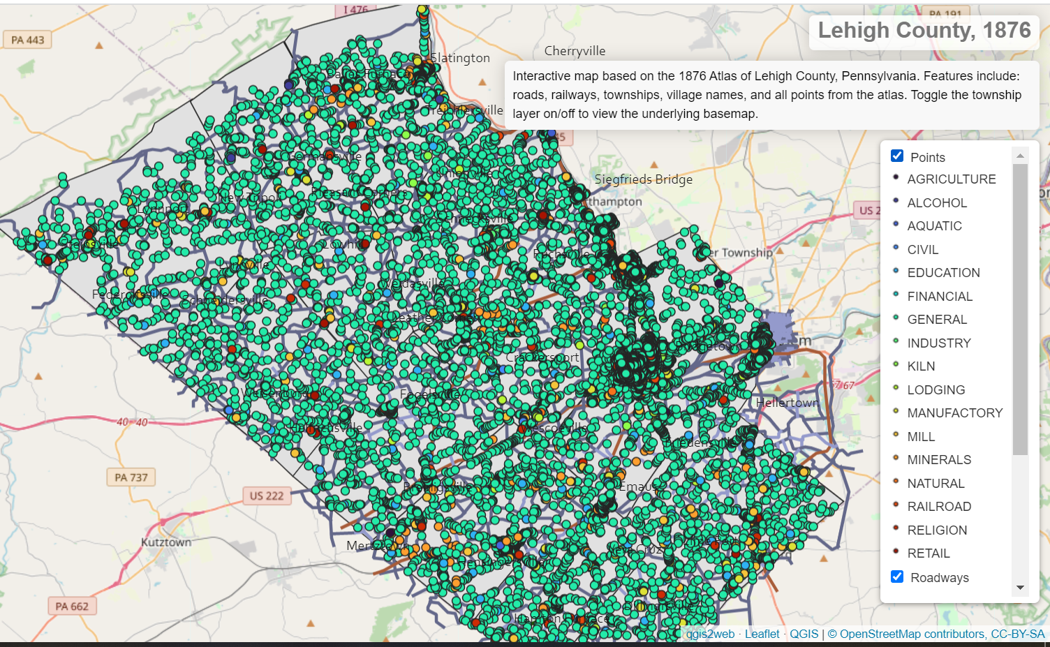
For quite some time, I’ve been meaning to learn QGIS and to experiment with alternative ways to publish my spatial data online. I decided to do both by dusting off some old data from a Fall 2016 research project. Below is the culmination of this two-day project: a map displaying historical data from an 1876 Atlas of Lehigh County, Pennsylvania. (Explore the map in a new full-size window or tab by clicking this link.)
The map displays data that I extracted from the New Illustrated Atlas of Lehigh County, Pennsylvania (1876). I downloaded high resolution images of atlas pages (each page contains one or more townships or municipalities) from the excellent David Rumsey Map Collection and georeferenced the images in ArcGIS. Then, I created points, polylines, and polygons that mirrored the locations, roads, railroads, and townships from the georeferenced maps.
I decided to revisit this dataset after I downloaded QGIS earlier this week. It took some time to become reacquainted with the data after spending the last few years buried in my digital archive. It did not take very long to figure out QGIS. The program was pretty intuitive and I quickly learned how to manipulate my data within it. I did run into some trouble when it came time to export the data as a web map. I encountered several errors that originated from the road layer symbology and data extent. Once I simplified the appearance of the road layer and corrected the data layers’ extent, I exported the map using the Leaflet library. The final version takes up less than 8 MB of disk space, 1.3 MB when compressed! (Note: I’m grateful for Ujaval Gandhi’s QGIS tutorial on Web Mapping with QGIS. It was easy to apply the tutorial’s step-by-step instructions to my project.)
I recommend opening the map in a new browser tab or window. All of the map layers can be toggled on/off by clicking the check box. You may find it useful to turn off the township layers to reveal the underlying base map. Toggling the road layer could also help to declutter the map. The map features clickable points representing all of the point data on the 1876 Atlas. The points are color-coded by their general category. Click a point to open its data window that contains its relevant information about the point, including: associated names, point type and genre, and the municipality and/or township the point is in. While most points are listed as “residential,” those points located outside of villages are most likely farms. (The 1876 Atlas did not discriminate between different types of locations in how it printed data.)
While there are a few things that could be changed on the map to improve its aesthetics, it fulfilled my main goals of the project: (a.) learn the basics of QGIS; (b.) publish a map online that is accessible to anyone (it doesn’t require any user account to view) ; (c.) dust off and share some data that I spent a TON of time to create but that has had little use over the last few years.